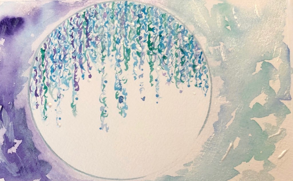
So much for “going with the flow.” I have been working on this image for quite some time and trying different techniques to get “flow.” Flow for me is that sensation of feeling present and fulfilled in a moment. That is not happening as yet with this project.
I finally decided to test out a different approach on a scrap piece of Arches watercolor paper which is so lovely to work with. Using the wet on wet method, I placed streams of water and then dropped in various colors of blue, blue-green and silver.
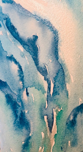
Watching the colors move as I turned the paper vertically, up and down was like meditating. Because I approached this as a “test,” I decided to place a few drops of rubbing alcohol on the watercolor to see what would happen. Oila! I liked the result so much that I started seeing this as an original and not a draft.
All I needed to do next is to figure out how and where to place the Globe. The globe is symbolic for my Go Lisey series.
I took my time creating the streams on the globe and layering on silver water color. When I was happy with the painting, I took a photo and uploaded the watercolor for printing. The image was either too washed out, too pixelated or too vivid.
With my husband’s support and using his camera, we came up with a picture that captured more of the texture. The colors however were not translating to the print media.
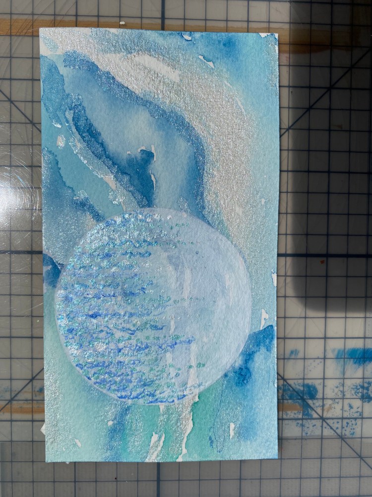
Original 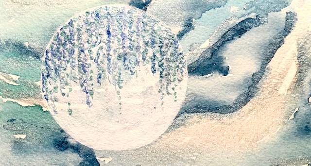
Warm Hue 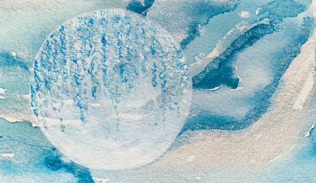
Cool Hue
I feel like I am spending too much time to ensure the original translates satisfactorily when printed. The reproduction needs to evoke as much joy as the original. I even tried scanning the original and then converting it to jpeg so that I could embellish the color.
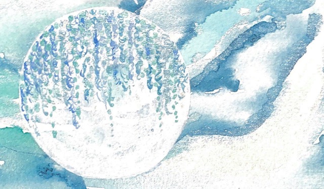
The scan-converted-to-jpeg with color edits seems to be getting a little closer to the result I seek. But the print version was too pale.
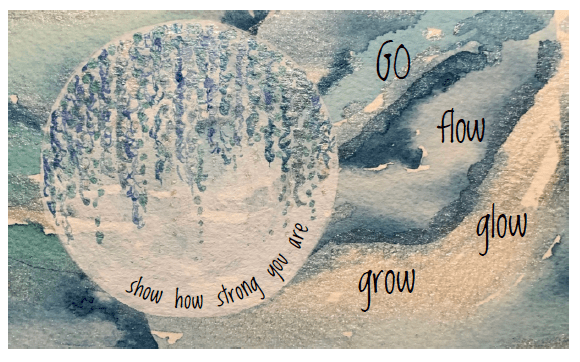
After stepping away from the project and starting with a fresh image of the original watercolor, and without changing the brilliance or tint, I have a naturally warmer hue; more than I envisioned for this image. The warmth however is a nice companion to the coolness of the blue and silver.
Here is a picture of the final note card with its message. It is ready to be reproduced. Once copies are made, I will hand embellish the art with some silver shimmers and dots. Here is to Go Lisey. She has taught me a lot about flow.

Leave a comment